| Applies to Product: |
|
|
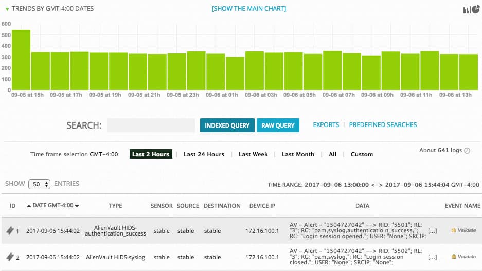
At the top of the Raw Logs page, found by navigating to Analysis > Raw Logs, you can find graphical representations of raw log statistics, either as bar graphs or pie charts. This is a quick and useful way for monitoring activity and event types.
Bar Graph
The bar graph shows how many logs were created and over what period of time. This indicates the trend over a specified period. By default, the graph shows the last twenty four hours of logs. However, you can select the the last week, the last month, the last year, or all of the logs in the Logger since USM Appliance was set up. You can click an individual bar of the graph to isolate the logs for that specific timeframe.
The associated logs appear in the Log list below the graph.

Pie Charts
The pie chart shows the logs on a particular sensor IP address or by event type.
The Logger pie charts show the number of logs as a percentage of total and focusing on the following:
- Sensors — Shows all of the events grouped by USM Appliance Sensor IP address.
- Event types — Shows all of the events grouped by type.
- Sources — Shows all events grouped by up to 10 source IP addresses.
- Destinations — Shows all events grouped by up to 10 destination IP addresses.
To access the Logger pie charts
-
Click the pie chart icon (
 ) on the upper-right of the graph to open the graphs window.

 Feedback